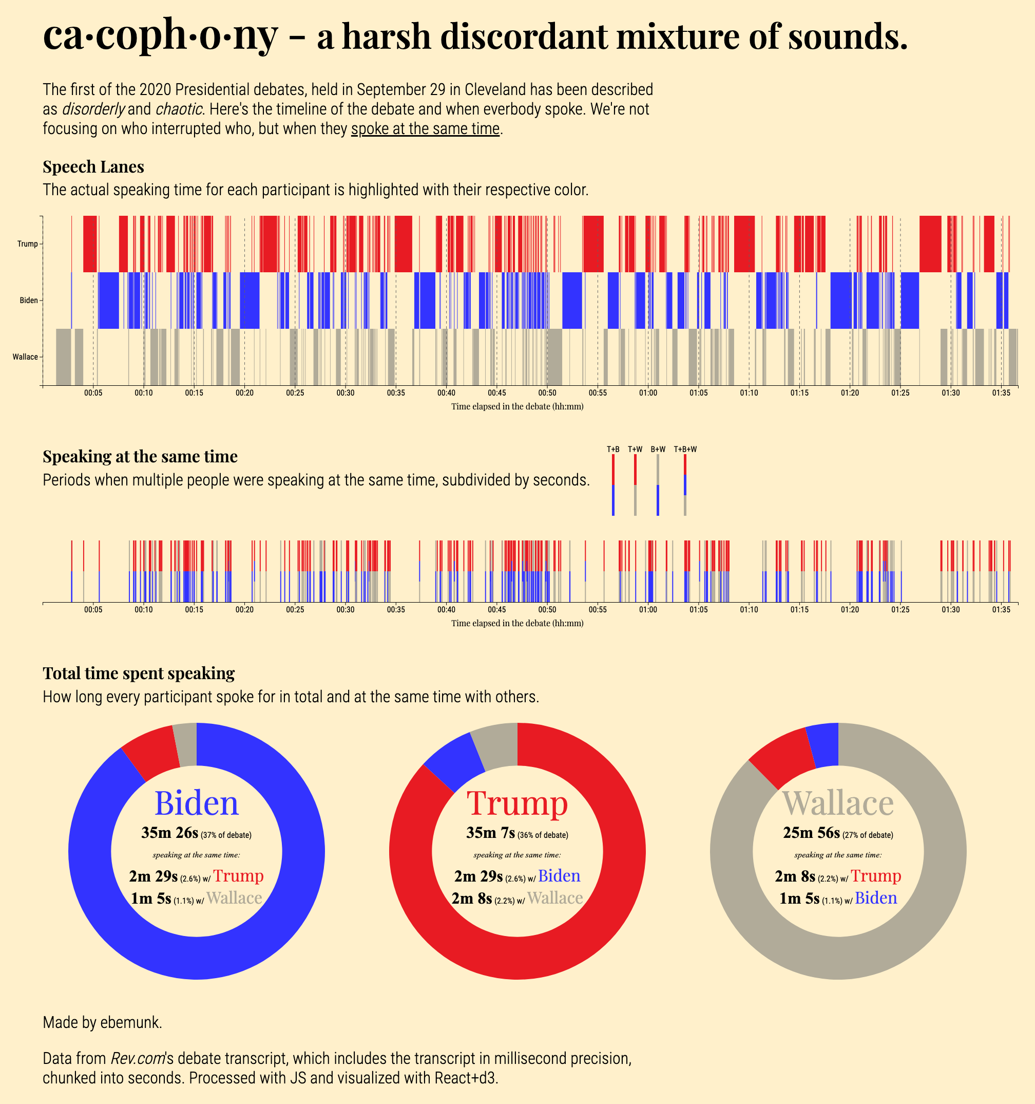
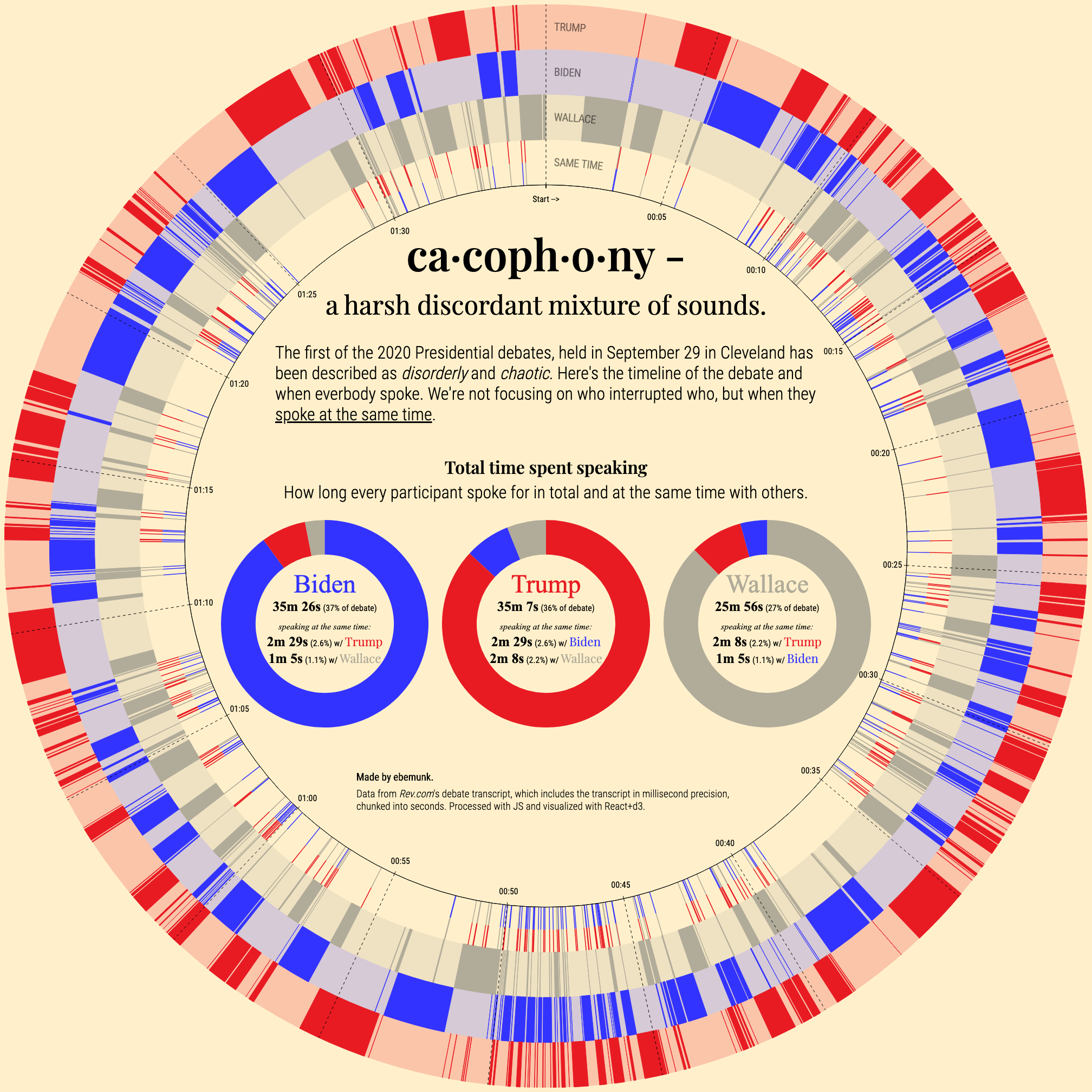
I always get glimpses of cool ideas when I see great data, and after watching parts of the First Presidential Debate of 2020 I knew I had to do something with it. The transcript over at Rev.com contains incredibly detailed and millisecond timestamped data.
Hearing about how chaotic the debate went (and witnessing it after digging into the data), I wanted to look at how often people spoke over each other.
Click on the graphics to see it in full size.
As I was making the pie charts, I thought why not try a polar version - maybe it’ll make for better visual interest.
Interested in prints of these graphics? I have a few copies printed on beautiful art paper. Reach out on twitter.
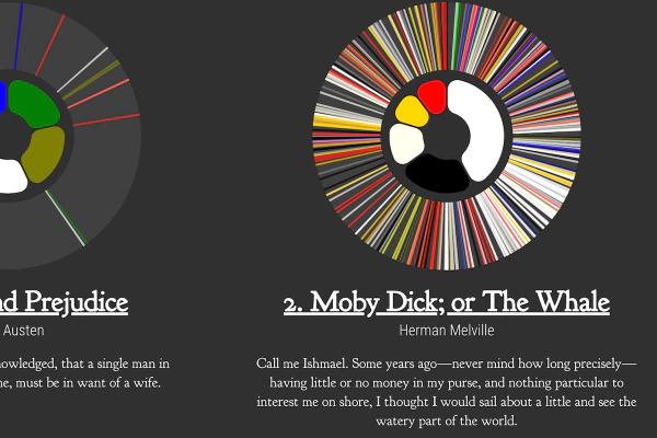 Color in Books
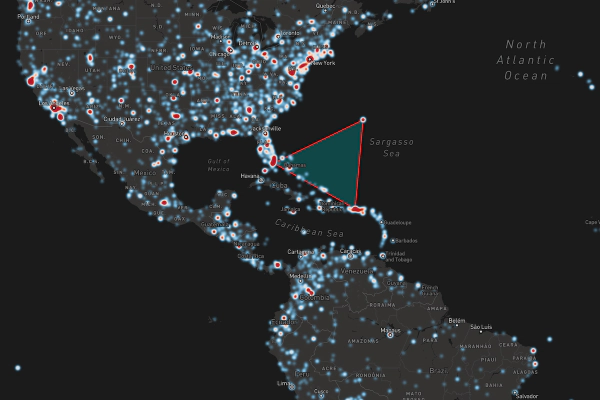 One Century of Plane Crashes