We’re looking at the year of 2018 in Vancouver through the lens of event listings on the Georgia Straight Events page. I find their list extremely useful and use it all the time to find cool things to do, and notice a great deal of events happening all over the city. I collected all the events over the course of 2018 and wanted to make a “map of the city” from this data.
Keep scrolling down to navigate between sets of data. What we’re looking at are heatmaps of events, which are coming from the postings on Georgia Straight. Click on the legend to focus on a single item, and click again to unfocus.
I hope that gave you a new perspective on Vancouver! I would love to see other heatmaps you make, please feel free to share the URL in the comments. Lets examine few more things I found interesting among the data.
Start Date
The events contain information about their start and end dates. Looking at variations in days of the week and months are quite revealing.
There’s an interesting ramp-up effect to Saturday, when most events start off. I think this combined with the sharp decline on Sunday says something about how Vancouverites make use of their weekend: Saturdays for fun stuff, Sundays to chill.
Locations
The chart below shows the top locations that events take place in (>60 events). Some are surprising to see, like The Art of Loving. Others are expected, like Vancity Theatre which seems to post about every movie, and Rickshaw Theatre which is always a good time.
Technical Details
The Georgia Straight Events page is a great resource, but it’s very hard to navigate and browse. I scraped their list twice a day through 2018, and gathered geographical location data using Google Geocoding API. Luckily the page contains Schema.org metadata which makes it easier to parse. These visualizations only include those events for which I could get geographical data for, and within 45 kilometres to Vancouver city center.
The visualizations were made with React, Mapbox, and d3. Here is the source for the scraper, and here is the source for the visualizations on this page.
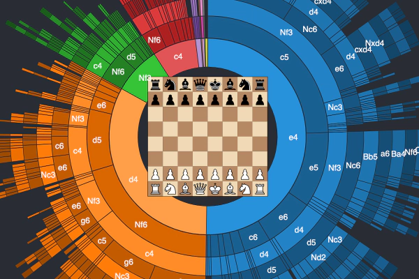 A Visual Look at 2 Million Chess Games
 One Century of Plane Crashes